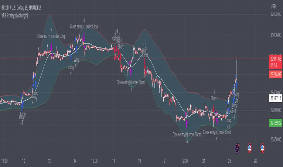
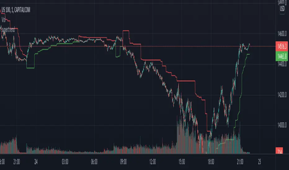
Pivot High/Low ComparisonThis script will show you at a glance the following trends:
Higher Highs (Green line on top)
Lower Highs (Red line on top)
Higher Lows (Green line on bottom)
Lower Lows (Red line on bottom)
It utilizes the Pivot High and Pivot Low functions to determine if the previous pivot was higher or lower than the current pivot .
Cerca negli script per "high low"
Multi-timeframe Harmonic PatternsHello friends. In recent months I have been busy with my academic research and haven't had much time to publish new scripts. To fill the gap of these months, I decided to publish the indicator Multi-timeframe Harmonic Patterns . Harmonic technical chart patterns can predict the next price trend and provide traders with clues to the price direction, which is one of the indicators widely used by professional traders.
(1) Indicator description
This indicator is built on ZigZag Multi Time Frame with Fibonacci Retracement@LonesomeTheBlue . Thanks to LonesomeTheBlue for contributing the awesome indicator
The indicator supports 6 different timeframes , and 25 different harmonic patterns
This indicator supports indicating key indicator prices: entry price, stop loss price, and two take profit prices
(2) Key parameters
timeframe resolution: The timeframe of the harmonic pattern
pivot high/low source: Calculation method of high/low pivot points
timeframe pivot period: Minimum period of high/low pivot points
delay for confirmations: Wait for N candles to confirm the chart pattern
bullish/bearish colors: Bullish/bearish pattern colors
enable harmonic patterns: Enable current harmonic patterns
show harmonic patterns: Show harmonic patterns found
show trading prices of patterns: Show key prices of harmonic patterns
(3) Supported Patterns:
Gartlay
Cypher
Bat
Deepcrab
Crab
Butterfly
Shark
0-5
AB=CD
3-Drives
Anti-Gartlay
Anti-Cypher
Anti-Bat
Anti-Crab
Anti-Butterfly
Anti-Shark
Black-Swan
White-Swan
Descending-Triangle
Ascending-Triangle
Symmetrical-Triangle
Headers&Shoulders
Inverse-Headers&Shoulders
Double-Top
Double-Bottom
————————————————————————————————————————
各位朋友大家好。最近几个月我忙于自己的学术研究没有过多时间更新脚本。为弥补这几个月的空缺,我决定发布该 多时间周期的谐波指标 。谐波技术图表形态在一定程度上可以预测下一个价格走势,为交易者提供价格方向的线索,是广大专业交易人员广泛使用的指标之一。
(1) 指标说明
该指标建立于 ZigZag Multi Time Frame with Fibonacci Retracement@LonesomeTheBlue ,感谢LonesomeTheBlue贡献的出色指标
该指标支持 6种不同的时间周期 ,以及 25种不同的谐波形态
该指标支持指示关键的指标价格:入场价格、止损价格、以及两种止盈价格
(2) 关键参数
timeframe resolution: 谐波形态的时间周期
pivot high/low source: 高/低枢纽点的计算方式
timeframe pivot period: 高/低枢纽点的最小周期
delay for confirmations: 等待N个蜡烛以确认图表形态
bullish/bearish colors: 看涨/看跌的形态颜色
enable harmonic patterns: 使能当前的谐波形态
show harmonic patterns: 显示被发现的谐波形态
show trading prices of patterns: 显示谐波形态的关键价格
(3) 支持形态:
Gartlay
Cypher
Bat
Deepcrab
Crab
Butterfly
Shark
0-5
AB=CD
3-Drives
Anti-Gartlay
Anti-Cypher
Anti-Bat
Anti-Crab
Anti-Butterfly
Anti-Shark
Black-Swan
White-Swan
Descending-Triangle
Ascending-Triangle
Symmetrical-Triangle
Headers&Shoulders
Inverse-Headers&Shoulders
Double-Top
Double-Bottom
Yearly High/Low IndicatorThis is a basic line drawing script which will draw lines for the highest and lowest prices for each year on a chart. High lines will be green and low lines will be red. Each line is labeled with the year and price that it represents. It takes in a single input value which is the year to start marking from. By default, the script will only draw the yearly high lines and a check-box can be selected to enable the low lines. The high line can, similarly, be disable should you only want the low lines. I chose this default because I noticed that more often than not, with both enabled, the screen got a little too cluttered.
Known Issues:
If you set the starting year to the current year, the labels don't show up. I spent a while trying to figure out why but I gave up after realizing that if you only have one year selected, it's less important that they be labeled and it didn't bother me after that. If it bothers you, fix it and feel free to let me know how you did it but I'm not interested in working any harder on a fix right now.
Improved Chaikin Money FlowChaikin Money Flow is a well-known Indicator for gauging buying/selling pressure. Marc Chaikin intended this to be used on the daily timeframe to capture the behavior of price action at or near the daily close when larger-scale actors influence the market. The calculation is straight forward as described within the built-in TradingView "CMF" indicator:
1. Period Money Flow Multiplier = ((Close - Low) - (High - Close)) /(High - Low)
2. Period Money Flow Volume = Period Money Flow Multiplier x Volume for the Period
3. Chaikin Money Flow = 21 Period Sum of Money Flow Volume / 21 Period Sum of Volume
There is, however, a problem with this algorithm: it does not account for daily gaps in price action. This leads to the indicator sometimes moving out-of-sync with price action and/or an under-emphasis of the magnitude change of the indicator relative to the change in price action. This is a significant problem for someone trying to read divergences against an underlying.
Note: I have never seen a published attempt to improve this indicator which is why I decided that there had to be a way to do it.
In order to mitigate this issue, I have taken the basic script provided by TradingView and made a key modification. If the open of a candle is outside the range of the previous candle, then the close of the previous candle is used as the "high" for the current candle (in the case of a gap down) or the "low" for the current candle (in the case of a gap up). However, if the close of the current candle exceeds the previous close, highs and lows for the current candle are calculated as normal. I believe this accounts for gaps in price action without significantly altering the original intent of the indicator.
I have made four other minor tweaks:
1. Default style is color coded area above and below the Zero Line
2. Range scaled to +/-100 instead of +/-1 (displays better on graph)
3. Set timeframe to Daily (as that is the timeframe for which this indicator was intended by Chaikin)
4. Length defaults to 21 (which is what Chaikin uses)
taLibrary "ta"
This library is a Pine Script™ programmer’s tool containing calcs for my oscillators and some helper functions.
buoyancy(src, targetPeriod, maxLookback)
Calculates buoyancy using a target of `src` summed over `targetPeriod` bars, not searching back farther than `maxLookback` bars. See:
Parameters:
src : (series float) The source value that is summed to constitute the target.
targetPeriod : (series int) The qty of bars to sum `src` for in order to calculate the target.
maxLookback : (simple int) The maximum number of bars back the function will search.
Returns: (series float) Buoyancy: the gap between the avg distance of past up and dn bars added to reach the target, divided by the max distance reached. Returns zero when an error condition occurs.
efficientWork(length)
Calculates Efficient Work on `length` bars. See:
Parameters:
length : (simple int) The length of the ALMA used to calculate the result.
Returns: (series float) A -1 to +1 value representing the efficiency of price travel, bar to bar.
ma(type, src, length)
Returns the `type` MA of the `src` over the `length`.
Parameters:
type : (simple string) The type of MA required (uses constants that must be defined earlier in the script).
src : (series float) The source value used to calculate the MA.
length : (simple int) The length value used to calculate the MA.
Returns: (series float) The MA value.
divergenceChannel(divergence, hiSrc, loSrc, breachHiSrc, breachLoSrc)
Calculates the levels and states of divergence channels, which are created when divergences occur.
Parameters:
divergence : (series bool) `true` on divergences, which can be defined any way. On breached channels it creates a new channel, otherwise, channel levels are expanded.
hiSrc : (series float) The price source used to set the channel's hi level when a divergence occurs.
loSrc : (series float) The price source used to set the channel's lo level when a divergence occurs.
breachHiSrc : (series float) The price source that must breach over the channel's `channelHi` level for a breach to occur.
breachLoSrc : (series float) The price source that must breach under the channel's `channelLo` level for a breach to occur.
Returns: A tuple containing the following values:
sourceStrToFloat(srcString)
Converts the name of a source in the `srcString` to its numerical equivalent.
Parameters:
srcString : (series string) The string representing the name of the source value to be returned.
Returns: (series float) The source's value.
RSI Shadow by TartigradiaHave you ever wondered how much the RSI can vary during an open session? How much wicks can make the RSI overshoots before it retraces for the close?
This indicator plots the RSI shadow, which is the area between the highest and lowest RSI values attained during each open session, from the high/low wick price candle (ie, not the open value).
Technically, we calculate the RSI as usual for all past bars, except for current bar for which we use the high and low values to calculate the RSI Shadow bounds. The invisible PineScript loop then repeats this process for each bar.
In practice, the RSI Shadow provides 2 different informations:
1. This allows to visually represent the variability that historically happened for each bar, which help in better understanding the context at the time and may help predict future similar patterns.
2. The closer the RSI is to one bound, high or low, the more bullish or bearish respectively the price action is. Intuitively, when RSI is close to the high shadow bound, it means that price action is so bullish it often closes in proximity to the highest value attained during the open session, hence very bullish sentiment. And inversely for low and bearish sentiment. To ease visualization of these sentiments, a background highlighting is provided.
The indicator works under all timeframes, but it appears to provide a very reliable information with longer timeframe. The background highlighting showing the bullish/bearish sentiment based on the RSI Shadow appears to indicate crypto market cycles relatively reliably, with 2-3 consecutive bars with the same background color indicating a strong trend.
False positives can be reduced by looking at both the background color and the RSI direction, if both are congruent (ie, both bullish), then the trend indication is good, otherwise the trend indicated by the background color should be disregarded. An option was added to uncolor background if incongruent with RSI's direction.
There is also a "shadow margin" setting that allows to further reduce the number of false positives, at the expense of reduced sensitivity (a margin of 3 seems to eliminate most false positives).
Note: if you need a more complete RSI indicator with overbought/oversold signals, check out RSI+ (alt), which includes all RSI related indicators I make (such as RSI Shadow):
Fibonacci Ratios with Volatility(Weekly Time Frame.)Script is based on weekly time Frame. Fib ratios are drawn at the Open of the Market. Open price is compared with Previous week High , low and close. If weekly open is above Previous week high or low, Fib 0 % is plotted above High or the low as the case may be . If weekly open is between previous week high and low Fib 0% is equal to previous week Close and other fib ratios are plotted accordingly. As its vol based, works fantastically. This script is inspired by Fibonacci and Volatility script by PB GHOSH.
Simple LevelsSImple levels is a clean way to automatically plot important daily levels including:
Yesterday's High
Yesterday's Low
50% level between Prior High/Low
Today's Open
Premarket Low
Premarket High
This Daily Levels indicator is unique in its ability to:
-Plot all of the daily level PLUS premarket high/low levels (extended hours must be turned ON)
-Can hide past days levels, only plotting levels on the current day, to keep chart cleaner
-Can extend line levels right or fullscreen
-Plots the level price at each level on the chart
-Can show/hide price levels labels
-Can add supplemental premarket levels plot to show levels being formed during the premarket time period
-Coded with line.new vs plot so dashed lines are available as a style
-Automatically hides the indicator if the timeframe selected is Daily or greater
Weight Gain 4000 - (Adjustable Volume Weighted MA) - [mutantdog]Short Version:
This is a fairly self-contained system based upon a moving average crossover with several unique features. The most significant of these is the adjustable volume weighting system, allowing for transformations between standard and weighted versions of each included MA. With this feature it is possible to apply partial weighting which can help to improve responsiveness without dramatically altering shape. Included types are SMA, EMA, WMA, RMA, hSMA, DEMA and TEMA. Potentially more will be added in future (check updates below).
In addition there are a selection of alternative 'weighted' inputs, a pair of Bollinger-style deviation bands, a separate price tracker and a bunch of alert presets.
This can be used out-of-the-box or tweaked in multiple ways for unusual results. Default settings are a basic 8/21 EMA cross with partial volume weighting. Dev bands apply to MA2 and are based upon the type and the volume weighting. For standard Bollinger bands use SMA with length 20 and try adding a small amount of volume weighting.
A more detailed breakdown of the functionality follows.
Long Version:
ADJUSTABLE VOLUME WEIGHTING
In principle any moving average should have a volume weighted analogue, the standard VWMA is just an SMA with volume weighting for example. Actually, we can consider the SMA to be a special case where volume is a constant 1 per bar (the value is somewhat arbitrary, the important part is that it's constant). Similar principles apply to the 'elastic' EVWMA which is the volume weighted analogue of an RMA. In any case though, where we have standard and weighted variants it is possible to transform one into the other by gradually increasing or decreasing the weighting, which forms the basis of this system. This is not just a simple multiplier however, that would not work due to the relative proportions being the same when set at any non zero value. In order to create a meaningful transformation we need to use an exponent instead, eg: volume^x , where x is a variable determined in this case by the 'volume' parameter. When x=1, the full volume weighting applies and when x=0, the volume will be reduced to a constant 1. Values in between will result in the respective partial weighting, for example 0.5 will give the square root of the volume.
The obvious question here though is why would you want to do this? To answer that really it is best to actually try it. The advantages that volume weighting can bring to a moving average can sometimes come at the cost of unwanted or erratic behaviour. While it can tend towards much closer price tracking which may be desirable, sometimes it needs moderating especially in markets with lower liquidity. Here the adjustability can be useful, in many cases i have found that adding a small amount of volume weighting to a chosen MA can help to improve its responsiveness without overpowering it. Another possible use case would be to have two instances of the same MA with the same length but different weightings, the extent to which these diverge from each other can be a useful indicator of trend strength. Other uses will become apparent with experimentation and can vary from one market to another.
THE INCLUDED MODES
At the time of publication, there are 7 included moving average types with plans to add more in future. For now here is a brief explainer of what's on offer (continuing to use x as shorthand for the volume parameter), starting with the two most common types.
SMA: As mentioned above this is essentially a standard VWMA, calculated here as sma(source*volume^x,length)/sma(volume^x,length). In this case when x=0 then volume=1 and it reduces to a standard SMA.
RMA: Again mentioned above, this is an EVWMA (where E stands for elastic) with constant weighting. Without going into detail, this method takes the 1/length factor of an RMA and replaces it with volume^x/sum(volume^x,length). In this case again we can see that when x=0 then volume=1 and the original 1/length factor is restored.
EMA: This follows the same principle as the RMA where the standard 2/(length+1) factor is replaced with (2*volume^x)/(sum(volume^x,length)+volume^x). As with an RMA, when x=0 then volume=1 and this reduces back to the standard 2/(length+1).
DEMA: Just a standard Double EMA using the above.
TEMA: Likewise, a standard Triple EMA using the above.
hSMA: This is the same as the SMA except it uses harmonic mean calculations instead of arithmetic. In most cases the differences are negligible however they can become more pronounced when volume weighting is introduced. Furthermore, an argument can be made that harmonic mean calculations are better suited to downtrends or bear markets, in principle at least.
WMA: Probably the most contentious one included. Follows the same basic calculations as for the SMA except uses a WMA instead. Honestly, it makes little sense to combine both linear and volume weighting in this manner, included only for completeness and because it can easily be done. It may be the case that a superior composite could be created with some more complex calculations, in which case i may add that later. For now though this will do.
An additional 'volume filter' option is included, which applies a basic filter to the volume prior to calculation. For types based around the SMA/VWMA system, the volume filter is a WMA-4, for types based around the RMA/EVWMA system the filter is a RMA-2.
As and when i add more they will be listed in the updates at the bottom.
WEIGHTED INPUTS
The ohlc method of source calculations is really a leftover from a time when data was far more limited. Nevertheless it is still the method used in charting and for the most part is sufficient. Often the only important value is 'close' although sometimes 'high' and 'low' can be relevant also. Since we are volume weighting however, it can be useful to incorporate as much information as possible. To that end either 'hlc3' or 'hlcc4' tend to be the best of the defaults (in the case of 24/7 charting like crypto or intraday trading, 'ohlc4' should be avoided as it is effectively the same as a lagging version of 'hlcc4'). There are many other (infinitely many, in fact) possible combinations that can be created, i have included a few here.
The premise is fairly straightforward, by subtracting one value from another, the remaining difference can act as a kind of weight. In a simple case consider 'hl2' as simply the midrange ((high+low)/2), instead of this using 'high+low-open' would give more weight to the value furthest from the open, providing a good estimate of the median. An even better estimate can be achieved by combining that with 'high+low-close' to give the included result 'hl-oc2'. Similarly, 'hlc3' can be considered the basic mean of the three significant values, an included weighted version 'hlc2-o2' combines a sum with subtraction of open to give an estimated mean that may be more accurate. Finally we can apply a similar principle to the close, by subtracting the other values, this one potentially gets more complex so the included 'cc-ohlc4' is really the simplest. The result here is an overbias of the close in relation to the open and the midrange, while in most cases not as useful it can provide an estimate for the next bar assuming that the trend continues.
Of the three i've included, hlc2-o2 is in my opinion the most useful especially in this context, although it is perhaps best considered to be experimental in nature. For that reason, i've kept 'hlcc4' as the default for both MAs.
Additionally included is an 'aux input' which is the standard TV source menu and, where possible, can be set as outputs of other indicators.
THE SYSTEM
This one is fairly obvious and straightforward. It's just a moving average crossover with additional deviation (bollinger) bands. Not a lot to explain here as it should be apparent how it works.
Of the two, MA1 is considered to be the fast and MA2 is considered to be the slow. Both can be set with independent inputs, types and weighting. When MA1 is above, the colour of both is green and when it's below the colour of both is red. An additional gradient based fill is there and can be adjusted along with everything else in the visuals section at the bottom. Default alerts are available for crossover/crossunder conditions along with optional marker plots.
MA2 has the option for deviation bands, these are calculated based upon the MA type used and volume weighted according to the main parameter. In the case of a unweighted SMA being used they will be standard Bollinger bands.
An additional 'source direct' price tracker is included which can be used as the basis for an alert system for price crossings of bands or MAs, while taking advantage of the available weighted inputs. This is displayed as a stepped line on the chart so is also a good way to visualise the differences between input types.
That just about covers it then. The likelihood is that you've used some sort of moving average cross system before and are probably still using one or more. If so, then perhaps the additional functionality here will be of benefit.
Thanks for looking, I welcome any feedack
Better Heiken-Ashi Candles w/ Expanded Source Types [Loxx]Better Heiken-Ashi Candles w/ Expanded Source Types is an indicator to compare regular candles to traditional Heiken-Ashi candles to "better" Heiken Ashi candles. This indicator and comparison study appears an oscillator. The purpose of this indicator is to demonstrate a better way to calculate HA candles and also to demonstrate expanded source types. This indicator is meant to be used by advanced Pine Coders who wish to add fine-tuning to their indicators and strategies.
What are Heiken Ashi "better" candles?
The "better formula" was proposed in an article/memo by BNP-Paribas (In Warrants & Zertifikate, No. 8, August 2004 (a monthly German magazine published by BNP Paribas, Frankfurt), there is an article by Sebastian Schmidt about further development (smoothing) of Heikin-Ashi chart.)
They proposed to use the following :
(Open+Close)/2+(((Close-Open)/(High-Low))*ABS((Close-Open)/2))
instead of using :
haClose = (O+H+L+C)/4
According to that document the HA representation using their proposed formula is better than the traditional formula.
What are traditional Heiken-Ashi candles?
The Heikin-Ashi technique averages price data to create a Japanese candlestick chart that filters out market noise.
Heikin-Ashi charts, developed by Munehisa Homma in the 1700s, share some characteristics with standard candlestick charts but differ based on the values used to create each candle. Instead of using the open, high, low, and close like standard candlestick charts, the Heikin-Ashi technique uses a modified formula based on two-period averages. This gives the chart a smoother appearance, making it easier to spots trends and reversals, but also obscures gaps and some price data.
What's going on with this indicator?
- First, we have the options to select the candlestick type: Regular, HA, HA Better
- Next, and to demonstrate the expanded source types, I've added a simple moving average. In the drop down for the SMA source you'll notice something very different from the typical TradingView source selector. Here's how to decode the new names for the sources:
Close = close
Open = open
High = high
Low = low
Median = hl2
Typical = hlc3
Weighted = hlcc4
Average = ohlc4
Average Median Body = (open+close)/2
Trend Biased = (see code, too complex to explain here)
Trend Biased (extreme) = (see code, too complex to explain here)
... for HA and HA better, see the same set up as above but with different open and close values to calcualate the other source types
- For the HA better calculations, we run the close value through either an Adaptive, Kaufman, or T3 smoothing filter. The length for these smoothing filters, either 2 or 3, can be found in the code and is a constant value that shouldn't be changed. This smoothing is in inline with what is described in the article mentioned above
- Lastly, I've placed an SMA over the oscillator so that the user can test out the various sources explained above
Included:
- Toggle on/off bar coloring
AllTimeHighLowLibrary "AllTimeHighLow"
Provides functions calculating the all-time high/low of values.
hi(val) Calculates the all-time high of a series.
Parameters:
val : Series to use (`high` is used if no argument is supplied).
Returns: The all-time high for the series.
lo(val) Calculates the all-time low of a series.
Parameters:
val : Series to use (`low` is used if no argument is supplied).
Returns: The all-time low for the series.
Per Volume Price ImpactLiquidity, Information and Market Timing
* Market Liquidity
The term liquidity can refer to many things in finance. In this article, we will limit the scope of discussion to the market’s ability to transact without incurring a significant increase in volatility.
As we know, liquidity and volatility have an inversed relationship — the more ample the liquidity, the lower the volatility (attributed to transaction cost, price movement and, so on). With this understanding, we can say large movements in the market are driven by low liquidity. This does not seem to make sense because the markets are huge, how can it possibly be illiquid? Now, this has to do with how the market operates and how exchanges occur (This topic concerns the area of market microstructure).
* Order Book & the Trading Process
So how does a transaction actually occur in the market? Let’s assume we open a position with a market order. In this case, you will get the price on your quote board if there are enough units of assets people are willing to sell at that price. If there are not enough units, you will buy from the second-best price and so on until your order is filled. Now in the second case, as the order is being filled, the change in price is recorded. Therefore, if someone wishes to move the market, theoretically, they just need to buy up or sell up but it is problematic to do so.
Here is why:
while dry up the liquidity can make huge moves, it is inefficient to do so.
it takes a lot of money to do that
your position will be exposed, someone more resourceful than you may go against you and that is a huge risk
market manipulation charges
when you open a position, the entry price of the position is essentially a VWAP (volume-weighted average price). If you attempt to move the market and open a buy position at the same time, you will have a higher VWAP, eating into your own profit.
I think these reasons are sufficient in establishing why opening a position and drying up liquidity to profit is a dumb idea. But of course, the institutions are not stupid, the alternative is to enter your position first then move the market.
To measure liquidity one of the tools people use is the order book. It can offer an overview of the sentiment (by looking at the orders and changes in volume) and how people are positioned (if the broker offers such data). In my opinion, open interest is a much better tool than order as it records the transactions that have occurred, hence less prone to manipulations (google: “Navinder Singh Sarao”, the trader who used fake orders to manipulate algorithms to crash the market).
But to quantify the order book is so much work as well (there are ways, just difficult), what we can do is to make things simpler.
* Quantify Market Impact
We know price and volume reflect information, while the past technical information has no predictive power per semi-strong form of EMH, empirical studies have often tested this theory over a longer time horizon. In our case, precisely due to the mechanism of exchange and human behavior (The lack of incentive to move the market right away) we can, in the very short term (often intraday), foresee if the market is going to move or not. Back to the very definition of liquidity being the ability to transact without moving the market significantly, we can take this definition and quantify it with this formula:
Market Impact = (High — Low) / Volume
Why specifically “high — low”, because that’s the complete information in that moment and it is corresponding to the volume. A little crude but it is the simplest form.
A few things to take note of here:
We can only know the complete picture once the candle is complete. This is fine in most markets because it takes time to gather money and orders.
We often see high liquidity during certain time of the day, for example, when the market opens and so on. As a result, we need to take some scientific approaches to transform the data.
Now, this looks much better. To interpret this graph, the lower the value, the lower the market impact, the deeper the liquidity.
* Generate Tradable Insights
To generate trade ideas isn’t a difficult task, we all know the RSI, MOM, STOC, etc. all the indicators attempt to draw boundaries, and we can do the same but we need to be a little more advanced and critical.
step 1: we first need to normalize the data. To do that we will take the log of the values to make the skewed distribution normal. The result isn’t ideal if you zoom out but I think this is decent enough to work with. Here is
This is still not a stationary time series, but it looks stable enough and it mean-reverts. So we turn to our lovely standard deviation bands for help.
Step 2: Because this is not a stationary process (visually, you can test it statistically if you wish), we cannot just take sample mean and SD and also because we want to show off our data skills, so we turn to move averages and regressions. I’m going to use moving regression here because I think it is better (mean can be distorted by large values by a larger margin and it lags)
I’m using the moving regression band on TradingView and 1.5 SD here for convenience, you can try to optimize the parameters with codes or other regression models if you wish. But I think it is more important to understand the rationale here.
This step is essentially trying to figure out the anomalies in liquidity so that we can see when there is deep liquidity. This is also why choosing the parameter is crucial because you are essentially approximating how much informed trading is taking place (This is a concept in market microstructure for brokerages to set their spreads but it is not a good tool in a liquid market). By setting the level at 1.5 we are assuming about 86% of the time the market is in what we consider a normal liquid state. (again it is arbitrary, but based on the 68–95–99.7 rule of normal distribution). The rest of the time will be either low or high liquidity, When liquidity is deep, it perhaps, signals institutional money is pouring into the market and big moves may follow.
* Conclusion
There you have it, how to enter the market with the big bucks. But do take note there are plenty of assumptions and a lot to improve on here.
Same high/low updateHere I made a strategy out of my indicator. So, the trigger is double low/high on 1 week candle chart.
Entrance: close of the next candle if it's low/high higher/lower than previous one. (in most cases it's precise for backtesting)
Stop loss: long:low-one tick, short:high+one tick
Take profit: ATR*Multiplier (you can tune it in properties)
DailyDeviationLibrary "DailyDeviation"
Helps in determining the relative deviation from the open of the day compared to the high or low values.
hlcDeltaArrays(daysPrior, maxDeviation, spec, res) Retuns a set of arrays representing the daily deviation of price for a given number of days.
Parameters:
daysPrior : Number of days back to get the close from.
maxDeviation : Maximum deviation before a value is considered an outlier. A value of 0 will not filter results.
spec : session.regular (default), session.extended or other time spec.
res : The resolution (default = '1440').
Returns: Where OH = Open vs High, OL = Open vs Low, and OC = Open vs Close
fromOpen(daysPrior, maxDeviation, comparison, spec, res) Retuns a value representing the deviation from the open (to the high or low) of the current day given number of days to measure from.
Parameters:
daysPrior : Number of days back to get the close from.
maxDeviation : Maximum deviation before a value is considered an outlier. A value of 0 will not filter results.
comparison : The value use in comparison to the current open for the day.
spec : session.regular (default), session.extended or other time spec.
res : The resolution (default = '1440').
+ Ultimate MAWhat is the "Ultimate MA" exactly, you ask? Simple. It actually takes as its influence the Rex Dog Moving Average (which I have included as an MA in some of my other indicators), an invention by xkavalis that is simply an average of different length moving averages.
It's available for free on his account, so take a look at it.
I've recently become drawn to using fibonacci sequence numbers as lookbacks for moving averages, and they work really well (I'm honestly beginning to think the number doesn't matter).
You can see where this is going. The Ultimate MA is an average of several (eight) moving averages of varying lengths (5 - 144) all of fibonacci numbers. Sounds pretty basic, right? That's not actually the case, however.
If you were to take all these numbers, add them up, then average them by eight you'd get ~46. Now, stick a 46 period moving average on the chart and compare it to this one and see what you get. They track price very differently. Still, this all sort of sounds like I'm copying the RDMA, which isn't a sin in itself but is hardly grounds for releasing a new MA into the wild.
The actual initial problem I wanted to tackle was how to take in to account for the entire range of price action in a candle in a moving average. ohlc4 sort of does this, but it's still just one line that is an average of all these prices, and I thought there might be a better way not claiming that what I came upon is, but I like it).
My solution was to plot two moving averages: one an average of price highs, and the other an average of lows, thus creating a high/low price channel. Perhaps this is not a new thing at all. I don't know. This is just an idea I had that I figured I could implement easily enough.
Originally I had just applied this to a 21 period EMA, but then the idea sort of expanded into what you see here. I kept thinking "is 21 the best?" What about faster or slower? Then I thought about the RDMA and decided on this implimentation.
Further, I take the high and low moving averages and divide them by two in order to get a basis. You can turn all this stuff on or off, though I do like the default settings.
After that I wanted to add bands to it to measure volatility. There is an RDMA version that utilizes ATR bands, but I could never find myself happy with these.
I just wanted something... else. I also, actually made my own version of xkavalis' RDMA bands with some of the extra stuff I included here, but obviously didn't feel comfortable releasing it as an indicator as I hadn't changed it enough significantly in my mind to fairly do so. I eventually settled on Bollinger Bands as an appropriate solution to apply to the situation. I really like them. It took some fiddling because I had to create a standard deviation for both the high and low MAs instead of just one, and then figure out the best combination of moving averages and standard deviations to add and subtract to get the bands right.
Then I decided I wanted to add a few different moving averages to choose from instead of just an EMA even though I think it's the "best." I didn't want to make things too complicated, so I just went with the standards--EMA, SMA, WMA, HMA-- + 1, the ALMA (which gives some adjustability with its offset and sigma).
Also, you can run more than one moving average at a time (try running an HMA with a slower one).
Oh yeah, the bands? You can set them, in a dropdown box, to be based on which ever moving average you want.
Furthermore, this is a multi-timeframe indicator, so if you want to run it on a higher time frame than the one you are trading on, it's great for that.
ALSO, I actually have the basis color setup as multi-timeframe. What this means is that if you are looking at an hourly chart, you can set the color to a 4h (or higher) chart if you want, and if the current candle is above or below the previous close of the basis on that higher timeframe you will know simply by looking at the color of it ((while still being on the hourly chart). It's just a different way of utilizing higher timeframe information, but without the indicator itself plotted as higher timeframe.
I'm nearly finished. Almost last thing is a 233 period moving average. It's plotted as an average of the SMA, EMA, and Kijun-sen.
Lastly, there are alerts for price crossing the inner border of the bands, or the 233 MA.
Below is a zoomed in look at a chart.
Much credit and gratitude to xkavalis for coming up with the idea of an average of moving averages.
© AlpHay : FINRA SHORT DATA REPORT TABLE with QUANDL Data// Equity Short Data Report Table:
// Data Provider: Quandl => Finra (Nyse + Nasdaq + Bats exchanges)
// I am not a financial advisor or expert.
// This is my interpretation of FINRA's data. Consider this data doesn't represent the whole picture of what is going on!
// If you find some fundementally wrong thinking about this aproach, please inform me.
// I am open to suggestions. I am also looking for answers.
// Use it with a daily timeframe for data consistency.
// You can change the threshold values whatever you want.
// MFM (Money Flow Multiplier):
// mfm = close == high and close == low or high == low ? 0 : (2 * close - low - high) / (high - low)